Physiotherapy · Rehabilitation · Performance
Project Gallery
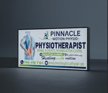
Swipe through all five views of the finished sign — from full-face to close-up detail.
1 / 5
Main Sign View
Swipe to browse
Building Trust Before the First Appointment
Pinnacle Motion Physio launched as a brand-new practice in a competitive healthcare market. Without an established reputation, their physical presence was their most powerful asset. The sign needed to communicate professionalism, energy, and credibility — converting curious passers-by into booked appointments.
Bold Identity on a Rigid Canvas
We designed a 2.4m × 1.2m full-colour Chromadek sign that fuses brand architecture with architectural scale. The custom logo — featuring the distinctive green-square crossbar in the A of PINNACLE — became an instant brand differentiator. The navy, white, and green palette communicates trust, health, and vitality in a single glance. We handled design, print, and installation end-to-end.
Technical Specifications
Brand Palette
Why This Sign Was More Than a Sign
For a startup physiotherapist, every detail matters. Here's how the right signage became the cornerstone of their brand strategy.
Starting from Scratch
Pinnacle Motion Physio entered the market as a brand-new practice with zero established reputation. Their physical premises would be their loudest first impression — and it had to count before a single patient walked through the door.
Standing Out in a Crowded Market
Healthcare signage tends to play it safe — generic fonts, dull palettes, forgettable layouts. We needed something bold enough to stop foot traffic and communicate credibility at a glance, turning a wall into a marketing asset.
First Impressions that Convert
For any healthcare provider, trust is currency. Patients make split-second judgements about quality of care based on appearance. A premium sign communicates investment, seriousness, and professionalism before any conversation begins.
New Age Brand Identity
Today's patients research before they book. A distinctive visual identity — one that carries consistently from exterior signage to Instagram to Google — is no longer a nice-to-have. It's an essential competitive weapon for a startup in any industry.
Advertising Baked Into Every Element
This wasn't just a sign — it was a strategic marketing tool. Here's how we engineered every detail to work harder for the practice.
Chromadek as a Billboard
Full-colour Chromadek delivers vivid, fade-resistant print on a rigid steel substrate. Every passing car and pedestrian encounters crisp, professional branding — a 24/7 advertisement with no recurring cost.
Strategic Exterior Placement
Positioned to capture maximum road and foot traffic, the sign functions as a passive marketing channel. Even when the practice is closed, it's working — building recognition and directing new patients.
Brand Consistency Across Touchpoints
The navy, white, and green palette used on the sign extends across business cards, social media assets, and digital platforms — creating a cohesive presence that multiplies trust at every interaction.
Patient Wayfinding
Clear, bold signage eliminates friction for new patients. First-time visitors can locate the practice with confidence, reducing anxiety and creating a positive experience before the appointment even starts.